When I hear the word “boundaries” I automatically feel a negative connotation but throughout this week I’ve learned that boundaries can be a good thing. For example setting limitations for oneself can be rewording. Take this thought into consideration, in yoga, yogis are reminded to honor their bodies and respect how far they can move and flex from pose to pose… not how well are deep of a stretch their neighbor is getting. And architecture can be looked upon in the same way. In Egypt Hatshepsut had a tomb made on and of the land. Being a great ruler, she had many materials that she could use but she for whatever reason limited herself to the local resources.

Scale:
From past lectures and recent learning’s I still feel that the Egyptians were overcompensating for size in their design. Take a look at Khufu’s tombs, they are enormous in size and the scale of hieroglyphics found on the interior of the tomb seams disproportional to the figure scales that I have learned in class. I suppose that this just goes to show that Scale can vary from culture to culture as it does from project to project.


Unity:
Over the past semester I have learned that in order to have a complete and working space, that space must exude dialogue with its surroundings and unity within itself. This semester we have furthered our learning in how unity is key to all aspects of design. What I mean to say is that there must be harmony or agreement between all objects in the place or space we have created. Diagram boards need to be structured and flow from one idea to the next all while portraying the same concept. In Greek Architecture one of the most important trinities is porch, hearth, and court. Take Akropolis for instance, all temples are united even thought there is clearly a hierarchal order. For my illustration I had chose to highlight the “porch of the maidens” as well as F.L. Wright’s “Robie House” fire place, because he strongly believed that the fire place was the hearth of every home.

Section:
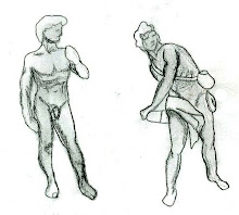
Webster’s defines section as-the part separated from the whole by division. But I as a design student define section as the ability to take an object at its most interesting part and “cut” it so as to see all levels of that object. Much like an architect would do in a section view of a drafted project.

Vignette:
Vignette is a French derived word meaning label, seal or sticker. However, what I gathered from drawing class was that it is a drawing which incorporates color which eventually fades towards the outer edges of the composition. With further examination of color, Roth suggests that humans are greatly influenced by light and color. On page 86 of Understanding Architecture Niels Finsen suggests that humans when, "exposed to red, for example, the body experiences an increase in muscular tension, the release of adrenaline, and increase in heartbeat, and a stepping-up of gastric activity." After have reading this and other fairy tails throughout the week I chose to create a vignette of a whimsical creature where I could incorporate the color red.


No comments:
Post a Comment