Sunday, March 29, 2009

[RE] Action

Newton’s law of motion: every action has an equal but opposite reaction. This is a wonderful was of looking at out next unit where we are studying revolutions and changes through European culture and architecture.


Rotation:

Roth (2007), “The best known was the cavernous Palais des Machines, built to house the large industrial exhibits at the World’s Fair in Paris, 1889, celebrating the centennial of the French Revolution.” (p.439)

Along with Palais des Machines, France has created many other fascinating revolutionary forms of art. Take for instance the 500 Meter Tower: this structure was at first considered to be an abomination to everything French. But as one can see in years to come Paris is not the city of lights without the 500 Meter Tower. It was all thanks to Effie’s dream of creating a vertically stretching structure that would turn they heads of future architects and the minds of the machine age designers.
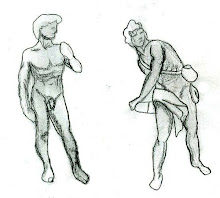


Movement:

Borromini’s San Carlo alle Quattro Fontane is a wonderful display of movement in architecture. His organic and curvaceous structure allows the viewers eye to move from one point of interest to the next. Movement in any element of design is extremely important. Roth, 2007 (p. 410)

In the last unit we learned that ancient and new cities were being designed with direction and movement of people in mind. The District of Colombia was designed as a diagonal city girded boulevard to move pedestrians and vehicular traffic through the city with three main points of interest the Judicial, Legislative, and executive.
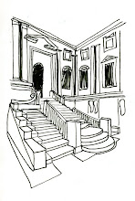


Reflection:

Galéie des Glaces (hall of Mirrors) Chateau de Versailles, France (p. 419) Like most things in Versailles Palace the Galéie des Glaces is overly gaudy in its decoration. This hall of Mirrors was designed to show off the wealth of the king in an indoor space. The space is decorated with chandeliers and glass mirrors placed across from the exterior doors, thus creating a reflection of the exterior landscape. Therefore bringing the outdoors indoors and making the space appear to be larger then reality allows.

Source:

Roth (2007), “They can be called Revivalist because of the fidelity to Greek and Roman source material in their details.” (p. 425)

This past week we learned how to alter natural light with materials provided. The biggest challenge was to figure out how to make a hard dense object such as MDF and card board illuminate natural light. I found the best way to do so was through a series of measured cuts and joinery which allowed natural light to project through the cuts and out on to the viewers eye. The proximity between the cuts is important in creating visual satisfactory as well as to create intersecting points of interests to move ones eye form begging point to end.


Illumination:

In our reading we find the Extocie of San Therisa to be and extraordinary piece that is mad of hard materials such as metal and stone; yet, the piece is well lit the use of natural light. The creator took in account that colors like gold and polished materials, such as stone and metal are conducive to reflecting light. This way the design looks as if there is a back lighting even in a time where electricity was unattainable.


Reflection:

This week’s pool of words is similar to each other but also strongly diversified from one another. Reaction, Rotation, Movement, Reflection, Source, and Illumination: all these demonstrate a process, a progression, and a presence. A rotation cannot exist without movement as a reflection cannot occur without a source of light. For as Newton’s law of motion states: every action has an equal but opposite reaction; meaning without an initial force of light, mass, or matter nothing can occur to change or alter its original being.

Friday, March 27, 2009

Alternatives: Unit Summary

The Alternatives unit is one that teaches us ways in which to push the boundaries and extend beyond the expected or anticipated limits. One can find the beginning of this change in the Middle Ages, or more specifically the Renaissance period. During the Renaissance architects and artists like Bermini, Bermonti, and Michelangelo tested every previously know aspect of design and added their own style.

Take a closer look at the differences between Michelangelo’s and Bermini’s David. Michelangelo’s was super Hellenistic and had disproportionate head and hands in comparison to the body. Also his David appeared to be relaxed, almost as if he were thinking about the fight with Goliath. Where as Bermini’s David appeared more proportionate and to scale; also, his David is in an action/ mid fight position. These are two great examples of how the art world had begun to change in expression and form.

As for architecture during the Renaissance period; lines were less strict and more organic, curvaceous in shape. Take for example Michelangelo’s library steps. These steps were structured to resemble the journey one takes in gaining higher knowledge. The fluidity in its shape sticks out opposed to the more traditional street that leads up too the building itself.

Another key element that this unit teaches us is city planning. Originally before society really began to settle down, from their past and previous nomadic stages, they simply build whatever wherever. This created mass confusion and disarray to the cities plan; soon after realizing these problems; architects, governing powers, and sometimes the church took charge in planning out organized city structures. This process of thinking of alternative planning systems still holds true in today’s American city designs; where all major important land marks are defined by the streets that connect them to one another.

The Alternatives unit leaves us with new and innovative ideas on how to design outside the box. Actually this unit teaches us to not only think outside the box, but to through the box out the window. Almost non conclusively this unit ends in many a French and Italian Revolution thus causing artists and architects alike to look for employment outside of their nations state. Thus, beginning a new chapter and styling of a new genera and a new unit.

Wednesday, March 25, 2009

Grammar: Syntax


[re] vision:

An example of a great architect with extraordinary vision is Frank L. Wright. He has more than proven himself over the years in his accomplished works. For instance; when creating the Robie House he saw that the city near by was full of modern design and vertically reaching buildings. He wanted to bring the family/ home life back to its pioneer origins. So he then created a horizontally reaching home. But that’s not all Wright also decided that he was going to accentuate the horizontal values by the brick lay of the structure he even planned to have two different color types of mortar; one for the vertical and one for the horizontal spaces.

Roth (2007), “Other architects, possessed of unshakable self-comfidence and guided by a unique vision, simply invented their own idiom. Of these individualist architects the American Frank Lloyd Wright (1869-1959) was one of the very few who developed a philosophy of design capable of being unfolded throughout his long life.” (p.462-463)

In Wrights philosophy of design, he believed that the fireplace is the hearth of the building. Take for example his western Pennsylvania home, Falling Water, many will agree that the fireplace is the most extraordinary moment in that home. As far as vision goes, Wright had created the home with darkened hallways this way the occupant would be almost unwillingly pushed through the home and into the lighted living space. This was because Wright saw hallways as simply a passage way. Rooms were designed to be lived in not past through.


Audience:

Audience consists of a group of individuals who are observing an object or process. As the statement below from Roth Understands Architecture suggests, Frank L. Wright was absolutely catering to his audience in creating a home that would be different from work and suitable for living.

Roth (2007), “Wright exaggerated the horizontal lines to integrate his houses with their prairie settings, creating a strong connection with the earth.” (p.498)

In another section of Understanding Architecture Roth (2007) goes on to say, “the tiny room accommodating the staircase up to Michelangelo’s library is crammed with dark, massive architectural elements contrasted to the white walls. (p.383) This statement is refers to the library steps created by Michelangelo. Through my studies I have learned that these steps were created the way they were not just to be visually pleasing and delightful but also to symbolically represent the difficulties and hardships one takes on in the journey of gaining greater knowledge.
Character:

Roth (2007), “The Gothic alternative in this more creative phase of nineteenth-century eclecticism has come to be called High Victorian Gothic, because of its elaborate character… The colorful character of the profile is enriched by the multiple colors of the building materials, including red brick, stone, slate, and marble of various hues in the polished columns.” (p. 435) As we progress through our academic studies we learn that each genera is classified by its own character or sense of style.

Transition:

Roth (2007), “Guided by thee philosophes, European architects by the mid-eighteenth century began to reject the visual excesses of Rococo architecture in favor of a structural discipline shorn of extraneous ornament: the generative basis of architecture was transformed.” (p. 418) Like in any change, in the architecture world there is a transition from genera to genera and culture to culture.


Datum:

Datum is the measurement of something. So I have decided to measure the similarities and differences between Bernini and de Vinchi’s David. De Vinchi’s David was constructed first. This piece illustrates David leisurely standing with one hand resting on his shoulder. He appears to be reminiscing the fight that recently took place. In size his hands and head look disproportionate to his body. As for Bernini’s David: the sculpture possesses more fluidity and appears to be in the fight. Also this David is clothed and more accurately scaled to the human figure.

Reflection:

Whether it be the precision one takes in making accurate measurements or pleasing their audience, a designer’s charter will always shine through to their final product. This is way it is absolutely necessary to have a clear vision and a smooth transition form each step of design.

Thursday, March 19, 2009

President Annalisis: part II

Essay layout

Topic: Kaiyukan Aquairiam
Specific Goal: to describe, define, explain how the building was built and designed.

Introduction

I. Get the audience’s attention by making them imagine a place…
II. Identify the building by clearly stating what and where it is…
III. Explain why I chose this building.
IV. Preview my main points.

Thesis Statement: I will state my main points in a single, complete sentence; by listing the main points as a statement of fact.

Body ((Will contain at least two main points and no more than 5 main points. Each main point must have a minimum of 2 support statements. All main points and support statements must be full sentences.))

I. How this building came about
A. State my first support. (give facts and history)
B. State my second support. (why its culturally important)
C. Continue for all of your support as needed. (building materials)
1. optional level as needed. (exterior space)
2. optional level as needed. (interior space)
a. optional level as needed. (details)
b. optional level as needed. (publicity)

II. What the building is being used for
A. State my first support. (entertainment)
B. State my second support. (learning and research)

III. Will the building withstand the future
A. State my first support.(interview an architect on their opinions)
B. State your second support. (refer to the in class lessons and reading.. ie. Commodity, firmness, and delight)
Conclusion

I. Summarize my main points in a paragraph or two.
II. Give a final statement in a single sentence leaving the reader with a clear understanding.

Potential Problems:
I fear that because the building I had chosen to study is out of country there will be some security problems with getting floor plans and good quality information in English. Also I feel that I am at a disadvantage because the building is out of country therefore I am unable to visit or tour the structure. I originally wanted to choose the Maui Ocean Center because I was fortunate enough to be able to visit it; however, there was even less information available on that subject.

The one thing that may be in my favor is that the design company that constructed this building is an American based company. Also, from what I have researched, the organisation built this building sustainably. If students cannot gather information from the building or its designers is the University capable or sending official papers stating that we are in fact an institution of greater learning in need of research materials?

Wednesday, March 18, 2009

P-week


periphery:

Much like last weeks word boundary, periphery is a line that forms a perimeter or boundary of an area. As suggested by answers.com. In Roth’s, (2007) understanding architecture one could find “The old structure was gutted and offices and gallery space constructed around its periphery opening up a large atrium in the center of the building.” (p. 509) This last statement was speaking about the remodeling of Piazza D’ Italia by designer Charles Moore.

When I read this segment of the book it reminded me of the Atrium we have here on UNC-G’s campus. Now I finally know why it’s called the Atrium. The word periphery reminds me of peripheral vision which is why I chose to draw an underwater seen. Most fish shear a peripheral vision unlike that of the humans.


portfolio:

During the Renaissance period there had been quite a few political outbreaks in Italy it was because of this that many architects and artists sought for work in other countries. Roth, (2007) “ The Best known of these artists was Leonardo de Vinci, who was supported by Francis I in his late years, but among the architects who moved to France was Serlio who was commissioned to work on the royal chateau Fontainebleau and who published several of his volumes in France.” (p.315) During this time de Vinci had built up his portfolio.

I had chosen to draw my portfolio here at studio.


process:

Process is the steps taken to complete a project whether it is a story or a design. Every design has its own story and every story its own design. In a story there is a beginning, middle, climax, and end. The beginning consists of getting all the parts and charters together. The middle supplies a more in-depth thought process. The climax is the most exciting part of the story where the most drama or action takes place. And the end is where the story either comes to a conclusive stop or a screeching halt.

And the same can be said for design, of course with a few minor adjustments. The beginning is where all the thoughts and research take place. The middle is where the thoughts and ideas come together and start to move, while gaining momentum, toward one idea or train of thought. The climax is that eureka moment where the designer has reached an even better idea then they thought they could. And the end is when the project is either finished or about to take a new turn in starting over.
The reason I chose to draw lace is because in one area of Italy lace was so highly thought of, used, and produced that the Italian’s actually incorporated it into the facade of their architecture. This is a perfect example of process because in their design process they not only incorporated materials from the local area but also the latest fashion.


perspective:
Perception is the way one perceives or actually physically sees an object. I have chosen to draw a two point perspective of the Villa Rotunda. This building is located in Italy and it is special because instead of one façade it has four. The building is also a great plan example of a circle square structured ceiling.


professional:
This week in art history we learned that upper class Italian families usually had homes which consisted of three different levels. The first being open to the public and specifically used for holding business meetings; the second level was for close social gatherings; and the third was for family only. This layout is professional in the way that there are different areas that satisfy different needs of the family.

Also professionalism can be linked to our other vocabulary word- portfolio. Just this past week we had a portfolio review where we needed all of our projects to be presented in an organized thought-out manor. The students with the best grade got their high score purely by their professionalism.

http://www.answers.com/topic/periphery

Tuesday, March 3, 2009

Micro:Macro


Porch: Court: Hearth

According to Roth, Understanding Architecture (2007) p.186 begins the discussion of the Greek and their porch, court, and hearth. The example given in the book is the Acropolis palace where the porch is located at the front or entrance; the court- at the central part or meeting area in the space; and the hearth being the space of most impotents.

For instance in the common current day household the porch would be the front of the house where most of the crowd enters or the foyer; the court would be the living room or kitchen; and the bed room would be the hearth. If one takes a close look at Frank L. Wrights work, they would notice he always places the most emphasis on the fire place hence making it the most important object- the hearth.


Composition

Taken for the Delight section of Roth, (2007), “Everything else in the chapel is dimly lit, so that one's eye is automatically drawn to that brightest spot in the entire composition.” (p.75)

A composition is the entirety of a project. In the instance of the quote light was the defining factor that “made” the composition what it was. In Drawing we learned that line weight can drastically help the entire composition of work.


Diagram

Roth, (2007),“Thus, the diagram in Figure 1.7 shows the mix of utilitarian and symbolic functions at only one point in time. For a different period, past or future, ...” (p.16)

A diagram is made to aid the viewer visually in what has already been written. As seen on page 16 of Understanding Architecture there is both literal and pictorial images to help assist the reader in what is being said.


Inspiration

Is where an artist gets their idea from. Inspiration is closely related to president or concept. For example I got my insperation for this graphic from a model I had made earlyer this semester.


Detail

Roth, (2007) “It is the architect's task to select materials and to detail the ways they are joined so the building may endure these attacks for whatever is the desired period.” (p.131)

Detail Detail Detail… Every moment and element of a building should be very thought out by its architect. It is the designer’s job to pay attention to every detail. The picture I have chosen to represent detail is my detailed drawing from the Curry building here on campus. Because the light fixture is located in the Curry auditorium I thought that it was really quite creative to add the plan view of the auditorium in the background almost as a border.

Monday, March 2, 2009

Portal Project


Pat's Desk 2


Jeff's Building


Plan isometric


Plan and side view

Creation inspired word model


Diagram


Details Details Details


Here is a detailed drawing of a hanging light fixture which can be found in the Curry buildings auditorium. I thought that it was really creative to add the plan view of the auditorium in the background almost as a border. And the gray-green tone makes the light fixture standout more than plane white paper would.

Curry Building


Critique Room


Cologne Cathedral


According to source one, “It [Cologne Cathedral] is considered to be the monument of Christian belief, Gothic architecture and the intense faith of the people of Cologne. Aside from its intrinsic value and unique artistic designs, the Cologne cathedral is a testimony of the enduring perseverance of European Christianity.”

As we take a look at the exterior one will notice the beautiful harmony and balance between the contextual and hierarchical elements of design; which are directed towards the idea of “bringing heaven to earth.” Imagine walking around the Cathedral, on both the sides and back of the church one will find vertically rising structures accompanied with flying buttresses. Because Gothic churches were built with heavy masonry ceilings and vaults spread over a wide span they needed extra exterior support. The flying buttresses are not just there to add esthetic values but more importantly to reinforce the outward thrusting force on the Cathedral ceiling and walls. As we advance towards the façade we notice that it is made up of two vertically stretching towers and breathe taking graphic stain glass windows. The towers vertical shape is viewed as pointing or directing towards the heavens, almost as if to say that the church is the only transporter to heaven.

Now, as we move forward toward the interior of this building we notice stories from the Bible being portrayed on the floor, walls and windows of the cathedral. It has been suggested that society was more visually read then then they are now. Meaning that because the majority of society was unable to read literature the church had to find a different method in getting the stories across. The Church did so through their elaborate mosaics and stain glass windows. Moreover, and perhaps less literal is that the sheer grander of the sanctuary and its different moments of light streams that peer in through the stain glass windows allows the viewer to be over come with the power and grace of God.

It is no wonder why society as a whole was extremely influenced by Christianity. Without the use of today’s machinery and still being able to create structures that portrayed key elements of commodity, firmness, and delight all why telling the story of Jesus the Christ it would be hard for one uneducated individual not to believe in the deity.

Citation:
1 http://www.germany.com/places-to-see/cologne-cathedral.php
2.http://viewer.arounder.com/koeln/arounder_specials/koeln_dom/cologne_cathedral_west_facade.html
3.http://www.uncg.edu/~pllucas/Gothic%20Cathedrals/website%2003.31.08/compare4.html

Artifact wall