This video was made to show a model I made out of cement... In order to get all angles I thought a video would be best... my aggregate was twigs and leaves and my mold was a kick ball... enjoy.
Wednesday, December 10, 2008
Tuesday, December 9, 2008


Pie crust experiment

In this, one of my many attempts to cast concrete, I chose to roll out neverdry clay much like one would for a pie crust. I then placed the clay into the mold. Next I pored the concrete and let sit for 24 hours. This method has proven to be most efficient out of all of the other methods I have attempted to use.

Tuesday, December 2, 2008


Saturday, November 29, 2008


Tuesday, November 25, 2008
A Shelf Life

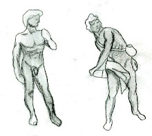
In this still life drawing I learned the importance of using different line weights in order to make a drawing stand out as well as creating depth in the overall composition.
Pathways Boundries Edges

The above drawing is a rough wright down of the information that I found during the research process. It was my job, as a member the the Environmental Group, to research solar lighting and its effects on the parking lot that we were working with.

Here is a continuation of my research and calculations as to where and when the sun's rays will hit the Gatewood Studio Arts Building's parking lot. In addition I learned how at different times of the year the sun will cast slightly different shadows.

In the above picture is a quick sketch on an idea I had which was to use recycled glass bottles in our bench structure; which is located on what is now considered gateway island. That way during different times of day and seasons the sun's rays would cast luminescent colors onto the pavement. Thus making the bench more then "just" a bench but also a sustainable work of art.

This sketch illustrates an other idea I had for what later became know as the oasis island. I planed that the bench or seating area would be a circular structure made of concrete which would enclose the tree trunk.

Later on during the project I was placed into the Building Edge group. Where we soon changed the name to "Living on the Edge." I had suggested "don't talk to me this project has put me on edge" but that idea was ruled out. Some of the ideas consisting in the notes which were taken in the above scanned copy were our groups many ideas and concepts. Some of these ideas consisted of creating structures that would contain and drain water, seating areas, stepping stones, and other structures.

Bark and Leaf

One day I was thinking of ways to practice my layering skills as well as my shadowing and gradation. So as I was walking to my dorm I noticed an interesting piece of bark and the leaf that lay next to it, I decided to bend down and pick them up so as to use them for my subject matter.
7-7 Salvation

Ah, the seven to seven... What better way to do community service then with your whole Architecture major from 7pm Friday night to 7am Saturday morning. Over then wild and crazy sleepless night I added myself to the Graphics group where it was our mission to understand Salvation Army's target customer and think up new innovative ways to help bring more business. Not only did this group use their creative mind but also their analytical mind. Some of the things that I came up with were:

The new reusable shopping bag- which would have the logo and saying of the company while reaming discreet. We also came up with ideas on how customers would get these bags; some where that they could be purchased at the counter, sent in the mail with news letters, or given with new promotional ideas. However, no matter how good we thought our ideas were we still knew that it would be up the the business to make the final decision on how their bags would be dispersed and whether or not they would use them. Seeing as the Salvation Army is a not-for-profit organisation we also suggested that special funds be raised simply for the production and disbursement of these reusable bags made from recycled goods.

An other image of the reusable shopping bag.

Once more, by taking a close look at the organizations customer data base we noticed that many of which came form Spanish speaking backgrounds. Therefore we felt that it was completely necessary to incorporate bi-lingual signs. The illustration above is an example of what one of the Z-rack signs may look like.

Something else that was brought up that night was the interior layout of the building and the need for clear advertisements and sectional signage pertaining to what could be located in different aisles and sections of the store. Above is and example of a potential end-cap sign.
Sunday, November 16, 2008

Thursday, November 13, 2008
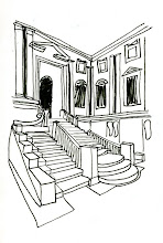
Perspective Drawings

One point perspective: of the Birdsboro Steel Mill in color pencil. I attempted to emulate the French Classical Baroque stylistic period in this composition (brown in the foreground, green in the middle, and blue in the background)

Two point perspective: of my old living room in color pencil. I attempted to emulate the European Baroque 17th century, the over all darkness appearance.

Extensive shadowing: of a kneaded rubber eraser that we twisted and set under an angled light fixture.

Areal view: of a table lamp
Tuesday, November 4, 2008


Tuesday, October 28, 2008
Practicing Perspective


Here are a few attempts at creating one point and two point perspective with shadowing. The most difficult aspect of these drawings was for me to re-create appropriate shadowing.
Wednesday, October 22, 2008


Monday, October 13, 2008
Dialog


For this project I used the fallowing: 12 skewers which were bent then coated with gorilla glue so as to hold the fibers of the sticks together. 12 plains, 6 of which were folded into triangles (3 pointing up and 3 pointing down) thus being different yet the same; 6 planes were folded in half horizontally then dripped with gorilla glue so as to separate them from the other 6 triangles. The gorilla glue was used as an adhesive, strengthening agent and decorative effect for its similarity in color to the skewers. The base consists of Styrofoam which is surrounded in a Bristol board boarder to incorporate unity with the entire project.

Over all my president is supposed to symbolise the genealogy of procreation with the central dividing part to represent a strand of DNA while the outer triangularly parts symbolise male and female.


Project joinery close up.

Project idea number 2.

Project idea number 1.
Friday, October 10, 2008
Light Fixtures


For all of the light fixtures I used pencil as my medium. As one can see I have changed my style several different times throughout the course of the project. The light fixture in the lower right hand corner is one of my favorites; it was also one of the more challenging ones for me to draw.
I later attempted to recreated the same image on a 10x10 inch sheat of drawing paper.
Subscribe to:
Posts (Atom)


